Case Study: How Ceralytics Used Data-driven SaaS Design to Elevate their Marketing Insights Platform.
↓

Jen is an incredible designer who was essential in building our brand.
Brandon Andersen, Co-founder
Introduction
By this point in my career, I’d been focused on user experience (UX) design for more than a Decade. This journey had taken me from enterprise software all the way to start-up SaaS. This case study will cover my UX-first approach to branding for Ceralytics, a start-up that cracked the secret to content marketing.
The Company
Launched in 2016 and later sold in 2021, Ceralytics is a content-intelligence platform that helps businesses identify the most relevant topics for their audience, not just the typical “hot industry trends” we’re all so used to seeing.
Once businesses understand what topics will truly drive engagement, Ceralytics also allows them to benchmark their competition in order to find further content gaps and target conversions.

The Challenge
Like many start-ups, Ceralytics had done their research and had their POC/back end systems ready to go but it wasn’t really a product just yet. The problem they were facing was multifaceted:
- The POC needed to be packaged into a usable, scalable, and sellable platform.
- A complete user experience needed to be built from the ground up, with limited time for user testing.
- The UX needed to be “skinned” with a brand-new UI design system; and beyond that, they needed branding for their new company (they had an existing logo).
- The completed platform needed to be marketed.
- …They needed all of this in time for a large conference, so the deadline was strict.
The Process
Since Ceralytics already went through their own product discovery phase, they knew what they needed to do at this point—and how quickly they needed it done. Their approach was to find a single contractor who could create & brand an entirely new product experience while also coding the front-end (oh…heeeey 👋 ).
Since I can handle each problem area directly—and since I was working with an experienced client—I was able to prioritize speed-to-market by skipping a few of the more traditional steps of the design process without sacrificing quality or causing any confusion along the way.

round one UX wifreframe with hover state interaction

round one UX wifreframe with dropdown menu interaction
Step 1: “Product-ize” the Existing POC
AKA, translate it into scalable software by creating a simple, user-driven UX.
Before anything else, I sat down with the company’s founders to ensure I really understood their story, mission, goals, and how they were addressing market gaps through their existing POC.
Once I had the full grasp of their vision, I presented multiple UX options so my clients could explore various ways of solving the problem. First, I created basic wireframes for the most common menus, controls, and pages in three different design patterns. Since were were working remotely, I then shared these options in presentation format so I could include some background rationale directly in-context as to why certain decisions were made, and why one may want to select a certain concept over another.

round three UX concept #1

round three UX concept #2

round three UX concept #3
Step 2: Create the Design System
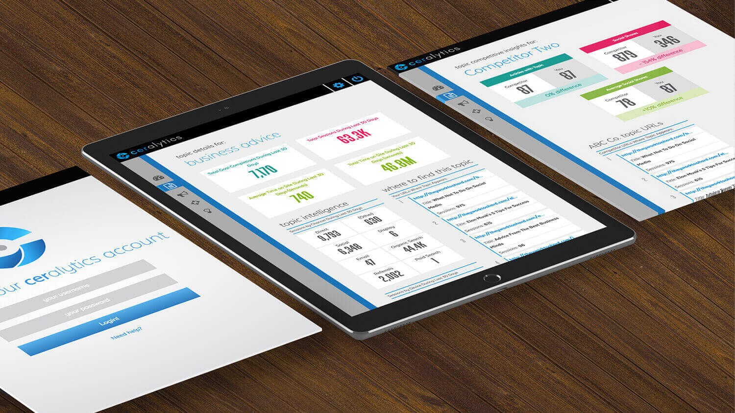
Once Ceralytics chose an overall design direction, it was time to slap some paint on that UX by creating an inviting, clean, and friendly visual system.
- As you can see in the above image series, after a few rounds of iterating the UX, I began applying a basic color palette for the company to approve in-tandem with finalizing the overall product experience.
- This was accomplished by adding a very basic UI style into the final UX wireframes, saving us precious time by eliminating extra rounds of work to approve.

Step 3: Build the Front-end & Component Library
Ceralytics didn’t have a front-end engineer yet, so I laid the groundwork in HTML/CSS/JQuery for them.
- Once the wireframes/concepts were approved, I moved straight into live-code to create 3 page template layouts for Ceralytics, eliminating the need to dedicate time & effort to interactive prototyping with tools like Axure.
- Once the layout templates were approved (both UX and UI) I built the styles for a full UI component library for Ceralytics to plug into their architecture.

When the front-end was completed and validated through testing, I handed off the code (with full design/branding system) to their head of development who then applied it to their existing POC.
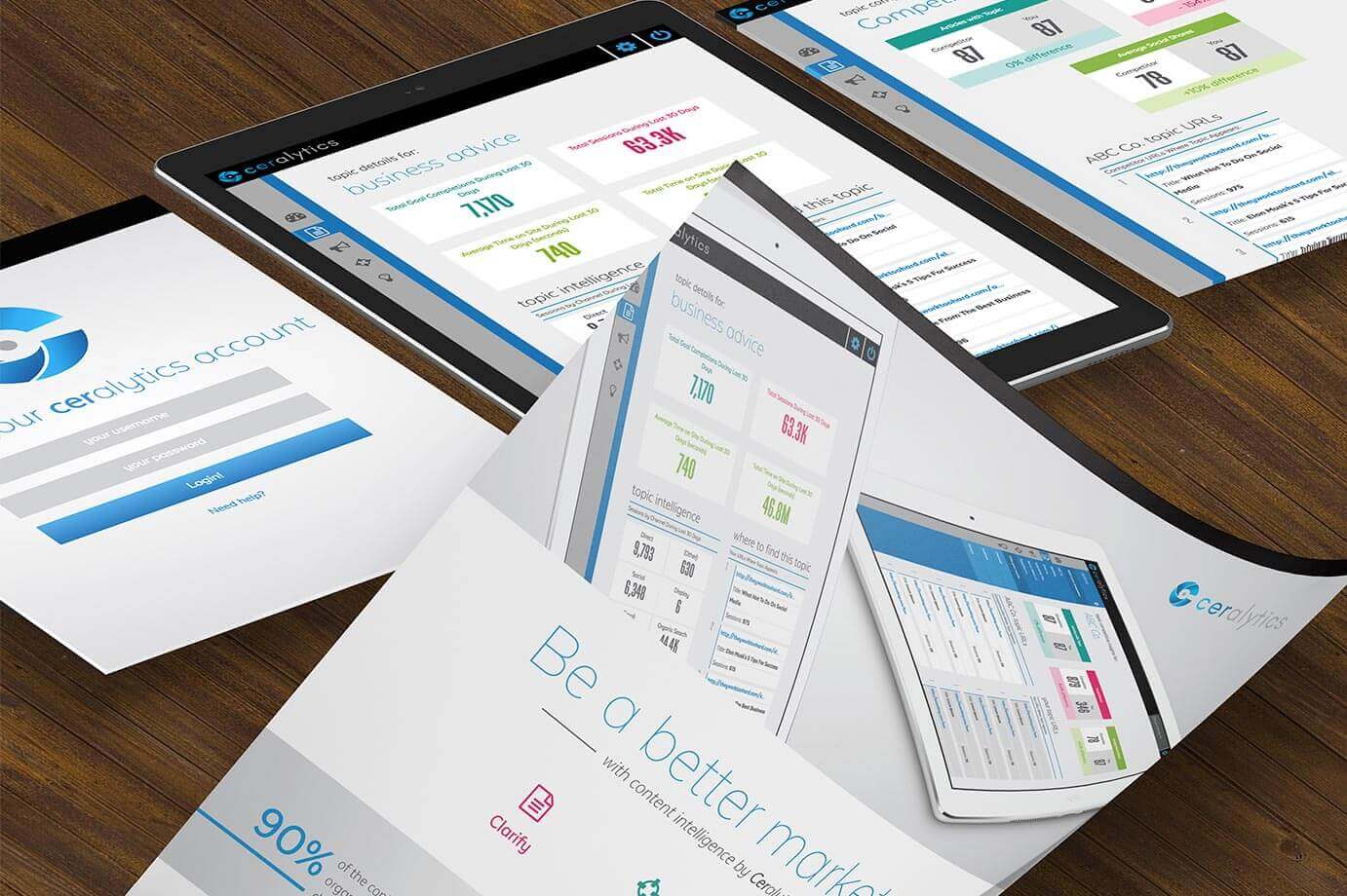
Step 4: Sell It!
I created some sales collateral to help with marketing efforts at their upcoming conference.
We also wanted it to be reusable beyond just the conference in hopes the launch would be a success (hint: it was!).
The Results
I am told as of the time of this writing—even though this interface was created in 2015/2016—Ceralytics still gets compliments on its ease-of-use and visual appeal.
The startup company was a success and sold in 2021.
My Takeaway
Start-ups move pretty fast! If you don’t stop and look around—wait, wrong lesson! 😎 🚗
To keep up with the speed of the start-up world, I had to figure out ways to shorten my own process without sacrificing quality. I’ve since been able to apply these new processes to freelance and full-time roles after working with Ceralytics.
Since I’m always looking to learn new ways of improving the efficiency of my processes, I consider this project a huge personal success and am grateful for the opportunity Ceralytics sent my way!
↓
If you need UX or a design system for your product, I gotchu.
Like what you see and ready to launch an engaging design system? Awesome!
