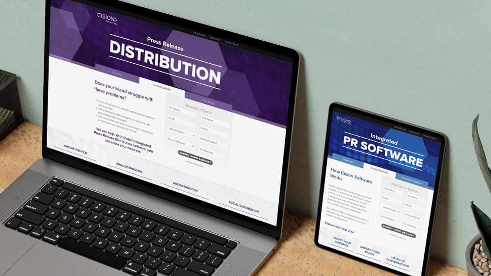
Portfolio Highlight: Results-Driven Direct Response Marketing & A/B Testing.
Acquiring Highly Qualified Leads is Difficult…
↓

So we Changed Our Approach to Developing SEM Campaigns.
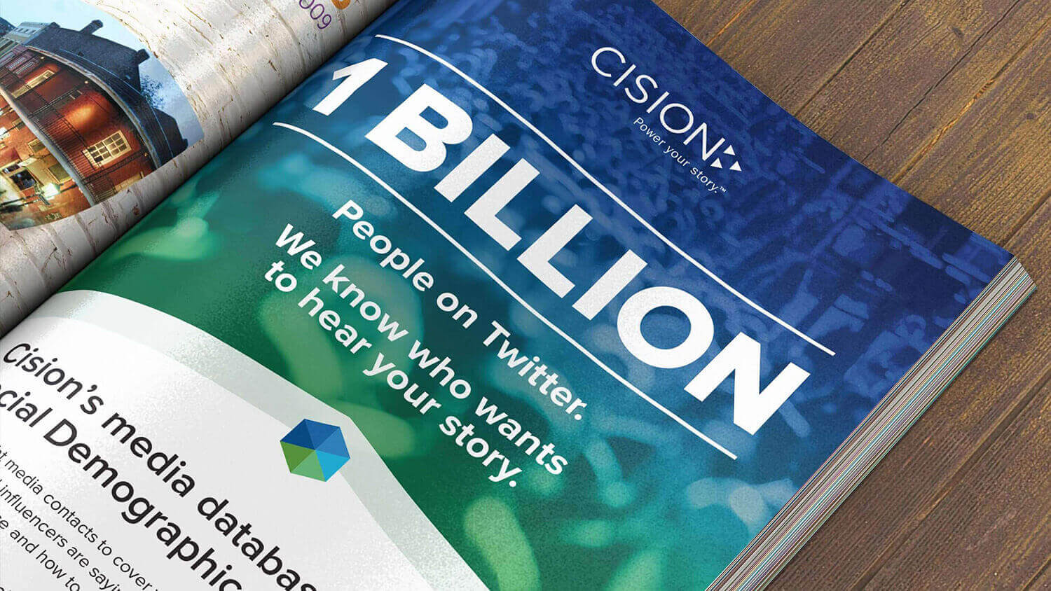
Cision was going through a rebranding, followed almost immediately by a merger. Not only did we need to get more leads—and fast—but we needed a refresh of our overall look and feel to match our new brand visuals.

Before: Cision’s previous campaign
The Challenges
- As you can see by the screenshot, the overall creative look and feel of Cision’s campaigns was becoming extremely outdated, even by 2013 standards.
- The new creative we developed had to work for multiple different keyword driven campaigns, so we couldn’t develop a look and feel that directly related to any specific keyword or software offering.
- For example, “Media Monitoring” also needed to say “Content Monitoring”, or “PR Software”
- I was directed to come up with 3 different creative directions that we would then be testing against one another.
Proving Out Value: Multiple Creative Directions for A/B Testing

campaign style A

campaign style B

campaign style C
The final creative deliverables for the all-new SEM campaigns were independently tested for round one. Each concept went live for 2 weeks and compared three layout options of each style. Pictured above is our “tabbed layout” style, which was a clear winner during that first round of testing for all three concept styles.
These winners from round one were all published for 4 weeks and constantly monitored for performance until we had a clear winner…
Campaign Style B Takes the Cake with a 33% Lift in Leads Over the Old, Outdated Style!

My contributions to this project included:
- Creative strategy
- Creative direction (art & copy)
- Display ad design
- User behavior research
- Responsive web page design & development
- Asset creation for A/B testing of multiple colors, layouts, content, etc.
- Asset management
- Content editing
Bonus Round: Guerrilla Marketing to Get Ahead of the Competition.
Cision had a competitor who started fighting dirty after our combination with Vocus, so we created an SEM strategy to interrupt prospective customers in response to their own disruption tactics.
 Cision’s “Just the Facts” SEM landing page
Above the fold” on-screen real estate in this case was critical.
The design for this particular section was meant to be bold and immediately tease the top two competitive offerings between Cision and Meltwater, encouraging the audience to scroll down.
To optimize the layout, I used Google Analytics to uncover the most common viewport size (1366x768) accessing our campaigns during the last 30 days, then optimized the copy around the targeted SEM phrase of “Cision vs. Meltwater”. After that, we jumped straight to the facts…

The “Just the Facts” campaign —between its highly-targeted remarketing ads and its bold landing page—delivered a 400+% increase in qualified leads compared our other general campaigns, proving that the truth really will set you free.
If you’re looking to optimize your digital campaigns, I gotchu.
Like what you see and want to create a bold campaign? Awesome!
