
Jen was the only one I trusted to fix our market presence with a GTM strategy that not only worked but reflected our brand vision.
—Sal Camarada, MeetApp Co-Founder & CEO
Introduction
MeetApp—a mobile app company focused on enriching event experiences—was preparing for rapid growth and needed to position themselves effectively with a strong go-to-market (GTM) strategy. This case study will cover my approach to repositioning the company for scale and elevating their brand.
The Company
Started by a group of colleagues-turned-friends, MeetApp was a mobile event-management app focused on increasing attendee engagement through interaction and socialization features, while also offering management tools for hosts. They operated internationally, so their GTM strategy needed to consider multiple markets. Working closely with teams in Stockholm and Chicago, I guided their branding and messaging to align with a global growth strategy.

Before: MeetApp’s previous website
The Challenges
MeetApp needed to redefine how they presented themselves to enter new markets at scale. Their challenges crossed a few critical GTM areas:
- Accessibility: Their brand colors failed ADA compliance, limiting their accessibility to wider audiences.
- Product Design: They didn't have an icon that visually conveyed who they were as a company, or even what they offered.
- Global Appeal: Their very bold, in-your-face logotype—although clear and simple—presented some legibility challenges and did not match their brand voice.
- Lead generation: Their website wasn’t optimized for conversion, which negatively impacted lead gen and organic SEO efforts.
The Hypothesis
Developing a more targeted GTM strategy—and ultimately, a more compelling, modern, and accessible visual identity—would elevate MeetApp’s market position, increase brand visibility, and drive lead generation.

Overview of the Process
I knew early on that aligning a brand strategy directly to MeetApp’s overall GTM goals would be key. It would help everyone focus on one area at a time, so we could keep moving forward without delays or confusion.
Tactically, we needed to balance a more professional brand image with engaging visuals, all while optimizing for user experience and conversion. Unlike the quick-and-dirty approach I took with Ceralytics—where we prioritized speed-to-market by combining some of the more traditional project management steps—MeetApp and I followed a more by-the-books process.
At a high-level, we focused on:
- Target audience personas that reflected MeetApp’s international market presence.
- A value proposition that was inclusive of MeetApp’s product offering and updated brand vision.
- Pricing that reflected the new value prop.
TLDR; after completing our first two steps and a thorough review of competitors, we determined pricing updates were not needed. - Marketing and promotions starting with a new visual identity and ending with various creative assets to support it.
- Distribution via a full redesign of MeetApp’s website.
Step 1: Target Audience
Defining the target audience is critical for any GTM strategy.
To start, I conducted a competitive analysis and created feature matrixes to examine & compare MeetApp to several key players in the event app space, like Whova, Eventbrite, and Bizzabo.
I then analyzed MeetApp’s core services and features, focusing on key functionalities that would appeal to different users, based on their specific needs for event management, branding, audience engagement tools, and even product promotions.
I also considered the unique challenges each audience might face, like logistical coordination, branded content creation, or event security, which helped me define each persona’s goals and pain points. Here are 2 example personas.
Meet, Emma!

Personal
Age: 32
Degree: Communications
Location: Stockholm, Sweden
Role: Event Manager
Company
Employer: multinational (500+ employees)
Industry: Finance
Duties: responsible for coordinating her company’s presence at large conferences and B2B events.
Goals
Streamline complex event logistics, improve attendee engagement, and provide a multilingual experience.
Challenges
Managing cross-team communication, handling last-minute changes.
Objections
Dislikes apps that lack customization and real-time updates.
Pain Points
Miscommunications, logistical complexity, and limited budget.

How MeetApp Excels Emma’ Expectations
MeetApp offers Emma a streamlined, localized platform that supports multilingual event experiences and allows her to manage complex event logistics efficiently, with more advanced customization and real-time engagement tools than competitors.
Meet, James!

Personal
Age: 54
Degree: M.B.A.
Location: New York, U.S.
Role: Product Marketing Director
Company
Employer: National (200–500 employees)
Industry: HR Technology
Duties: Leads product launches, app demos, and promotional events.
Goals
Increase attendee engagement and gather detailed feedback to improve future events.
Challenges
Personalizing events & evaluating attendee analytics on small screens.
Objections
Avoids tools that cannot be personalized lack strong attendee analytics.
Pain Points
Limited engagement tools and being forced to use only phone apps for management.

How MeetApp Excels James’ Expectations
MeetApp’s dual platform (available on desktop and mobile) gives James the flexibility he needs to manage events the way he prefers. Additionally, MeetApp’s seamless integration of branding, personalized communication, and attendee insights are more customizable than competitors like Whova, offering James the insights he needs to continue improving.
How MeetApp Serves This Audience Better Than Competitors
MeetApp excels by providing a seamless user experience with robust features, such as real-time updates, intuitive networking tools, and compliance with global security standards. Unlike competitors—such as Whova and Eventbrite—MeetApp offers superior integration with existing tools stacks and customizable branded event content templates, ensuring that communication is clear and interactive, regardless of location.
Step 2: Value Proposition
The need to update MeetApp’s value proposition wasn’t just about refreshing branding—it was about driving measurable business outcomes. We needed to reinforce brand differentiation by enhancing their market positioning to better penetrate a crowded event space.
Their existing value prop didn’t hit those marks; it was vague and didn’t address any pain points:
MeetApp transforms your meeting and event attendees into active participants and creates amazing experiences.
Now that we had nailed-down the official target market for MeetApp, we crafted a value proposition that was inclusive to their international presence, while also conveying its core benefits.
MeetApp empowers organizations to run fully branded, measurable, and interactive event experiences that drive engagement & streamline communication.
How the New Value Prop Supports a Stronger GTM
By aligning the new messaging directly to the pain points of event managers and highlighting core product strengths—like customization, engagement tools, and robust analytics—MeetApp was positioned as the go-to solution for companies looking to get the most ROI from their events.
Step 3: Pricing
While conducting the competitive analysis during step one, and comparing MeetApp’s pricing structures & features to those competitors, we concluded that MeetApp’s current pricing was well-aligned with market expectations and provided significant value to our newly identified target audience.
As a result, we determined that updates to pricing were unnecessary for the new go-to-market strategy, and actually already supported their goal of expanding market share by undercutting some competitors who offered less! Moving on from this step quickly allowed us to focus on enhancing marketing materials, instead.
Step 4: Marketing and Promotions
Before: MeetApp’s previous logo
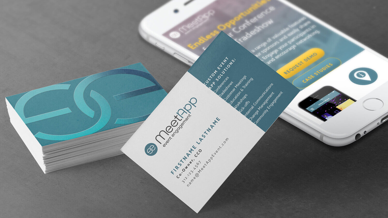
First Up: GTM Logo Design
MeetApp needed a redesigned logo that was not just modernized but scalable across global markets, adaptable to both print & digital channels, and more legible across multiple size treatments.
I started drafting some logo and icon concepts to better represent MeetApp’s personality by exploring concepts of “connection”, “innovation”, and “friendliness”.
Abba? Okay, MeetApp—let’s try it!
Their marketing director (based in Sweden) had an affinity for the Europop group, Abba. Once we got through the first couple rounds of more friendly, modernized logo concepts, she expressed an interest in exploring ways we could incorporate some type of treatment similar to the band’s logo (ABBA”, with the first B flipped horizontally) into the MeetApp logotype.
Right on; challenge accepted, MeetApp! I’ll even do ’ya one better—let’s explore the Abba style + aspects of your product’s solution directly into the icon…

round three color study option A

round three color study option B
Next, a New Color Palette
Understanding color theory and how colors work together is extremely important when creating a new visual identity.
Between logo iterations, I conducted a color study, creating & applying palette concepts to existing assets so MeetApp could see how their new colors would represent the brand, in-context. Even though it might seem like a lot of work, early exploration speeds up the process by eliminating guesswork down the road.
I like to follow the principle of work smart to streamline processes when I can, so I often take advantage of free tools to help me with palette creation, quick accessibility checks, and then verifying color contrast compliance as I work through final iterations.
We completed 4 rounds of color study explorations which led us to our final result; a friendly primary teal color with 7 supporting colors.

A New Typeface & Guidelines for Contrast-Compliant Text.
It was time to solidify MeetApp’s new brand personality by selecting a fresh typeface that worked well on websites, apps, and print use cases.
This new typeface also needed strong legibility at any (reasonable) size, and I always recommend fonts with large x-heights to achieve this—especially for use within websites and apps—where you don’t have any control over a user’s personal device settings & preferences.
We explored three different typefaces and assessed their fit to the new logo and to the overall feel of their new brand colors. Each typeface was placed into a mockup so they could be fairly evaluated in a real-world use case—just like how we chose the new color palette.
Bringing it All Together to Launch a Fresh, New Brand!

Main A
Text
Accent
Accent
Accent
Accent
Accent
Accent
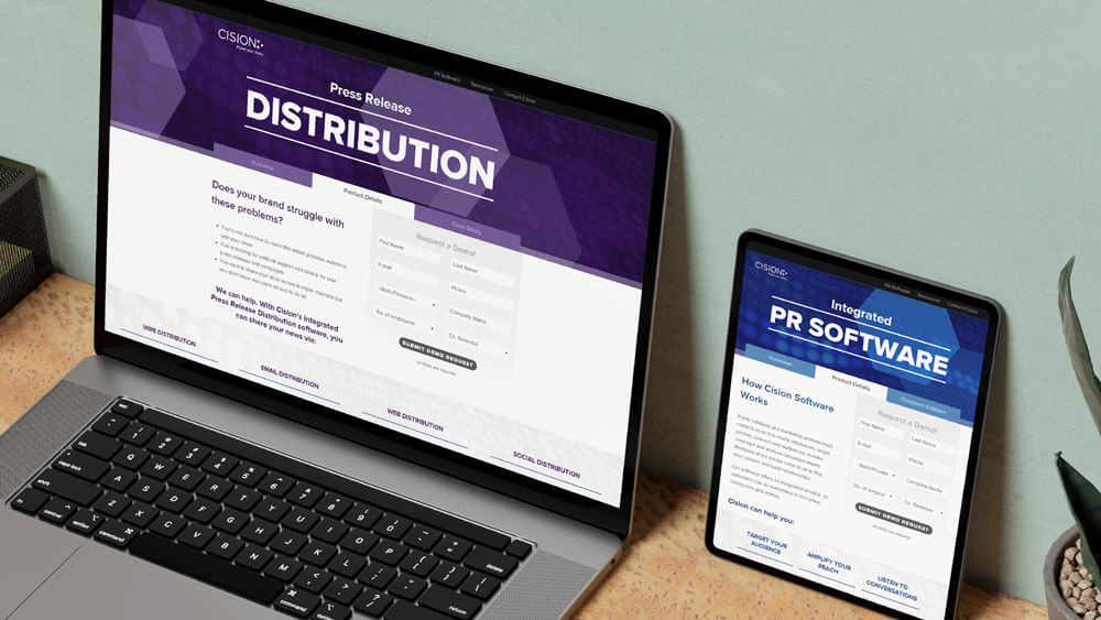
Step 5: GTM Distribution
It was finally time to apply a product-first (and conversion-focused) redesign to the MeetApp website.
Rebranding the MeetApp site supported the new GTM strategy by serving 4 main goals:
- Aligning the site with MeetApp’s new value proposition and placing emphasis on key features that differentiated them from their competition.
- Delivering more organic search traffic to decrease their existing AdWords spend.
- Improving marketing conversion rates with more direct CTAs that better targeted the pain points & needs of their audience.
- Modernizing the look & feel to ensure the design both represented MeetApp’s identity and met strategic product goals; enhancing user trust and engagement.

A product-first approach » because less is more.
I created a streamlined homepage with more direct and minimal language than what they had on the existing site. At first, it was a battle to get MeetApp to agree to less words “above the fold”, but eventually they came around and we secured a more simplified homepage.

A product-first approach » to give Google the correct signals.
This was the biggest content shift of the entire website project. The new site contained multiple “feature pages” in lieu of the single (and very, very long) list of features they currently had on a single page.
This allowed us to better communicate the product, utilize better CTAs right at the top of all pages, and above all, include H1 and title tags that told Google exactly what MeetApp needed to say.

A product-first approach » to improve conversion rates.
Creating individual feature-focused pages allowed us to embed testimonials and lead forms right into each page. This allowed MeetApp to continuously test and refine their marketing content in these areas to optimize conversions for specific features.
GTM Impact: Market Segmentation & Positioning
Each step of the branding & distribution exercises were aligned with MeetApp’s positioning in a competitive market. The redesigned logo and new color palette didn’t just serve aesthetic purposes; they helped MeetApp stand out and appeal to different segments, like corporate clients and international markets. By refining the website’s core content and user journey, we targeted decision-makers directly, which helped MeetApp enter new markets.
The Results
Rebranding had an immediate impact on brand recognition and lead generation. Market visibility improved, and the strategic design changes helped the company secure new leads in untapped markets. Their website’s new product-first layout improved organic SEO rankings, significantly reducing MeetApp’s reliance on paid search.
However, down the road, COVID brought on a series of challenges for an in-person event app. Due to their own innovative thinking, MeetApp survived the pandemic by capitalizing on the virtual features they had already begun implementing and rebranded yet again as a full-service event solution, Ventla, in 2022.
My Takeaway
This project allowed me to refine my skills in cross-market positioning, global collaboration, and user-centric design—all critical elements of a successful GTM approach. Looking back, I clearly see merging design with GTM strategy is practically a no-brainer! Since my collaboration with MeetApp, I’ve changed-up my personal branding and product design framework to a “question everything” / market-targeted approach.
Overall, I’d call this project (rather, series of projects!) a success, simply due to the breadth of work that was included, overall client satisfaction, and the chance to truly refine my overall communication & presentation skills.
↓
If you’re looking for GTM-driven branding or web design, I gotchu.

Like what you see and ready to elevate your GTM strategy? Awesome!