
To further advance our growth narrative, I needed to hire a ‘purple unicorn’ to rebrand & reposition, rebuild our website(s), overhaul our UX, and develop product growth strategies. Having worked with her before, I knew Jen was the only choice.
—Heidi Sullivan, UpCity’s SVP, Product & Marketing
Introduction
In 2019, I was presented with a unique in-house opportunity at a startup which focused on connecting B2B service providers & buyers. They needed to rebrand, update their messaging, revamp a Wordpress site, and solidify design systems for multiple products. Whoa.
The Company
Founded in 2009 as do-it-yourself SEO web application “DIY-SEO”, they were originally focused on helping small and medium-sized businesses optimize their SEO presence. In 2017, UpCity as we know it today was born as a B2B services marketplace where service providers would sign up for a free or paid subscription to list their services in the UpCity marketplace, further expanding their brand presence online.

Before: UpCity’s previous website (2018)
The Challenge
Like many emerging companies, UpCity had a small brand presence that had “gotten them this far” and some marketing materials to support it. But, the overall UpCity visual system was not to the level of its competitors and brand recognition was an issue. To solidify a truly professional market presence, UpCity was going to need some changes:
- Like MeetApp in 2016, the current UpCity logo was outdated and didn’t reflect their current market offering, values, or personality.
- Their color palette largely failed web accessibility checks.
- They were using a common & free typeface, which didn’t convey any personality or contribute to their unique offering.
- They were lacking a library of branded asset templates, hurting consistency.
- Their marketing emails were using common, out-of-box templates.
- Reports they delivered to partners were in spreadsheet format, lacking a professional touch.
The Hypothesis
Beyond a traditional rebranding, a complete overhaul of the UpCity visual design system & materials would strengthen both buyer and customer trust, market recognition, and make the company more attractive to potential buyers.

The 5-step Process
Timeline: March–August, 2019
Working with a fast-paced startup team meant I needed to rebrand (and create) a ton of assets really quickly while navigating & integrating myself into a passionate group. So, I had to prioritize working with them in a clear, educational, and data-driven manner—being absolutely certain I wasn’t offending anyone along the way in a careless, deadline-anxious rush.
Given this was my fourth rebranding initiative as an in-house creative lead, I knew breaking down the overall initiative into individual steps would help maintain focus, keep us moving forward without delays or confusion, and lead to a successful launch.
Step 1: UpCity Logo redesign
I started drafts for a brand-new UpCity logo and symbol to better represent UpCity’s personality and current product offerings.
UpCity needed a modern-looking logo that was more legible & distinguishable in multiple sizes. It also needed to include a softer, more friendly logotype and a new symbol that would visually convey who they were as a company while serving as an independent icon.
After only 2 rounds (a miracle?!) we moved into the next phase by leveraging one of the concepts for color & typography explorations. Cooperative Sans was the new UpCity logotype, representing aspects of the company’s values (trustworthy, accountable, collaborative & transparent), and friendly personality, while also meeting our legibility requirements.
After one final tweak to the new logo symbol, the concept was simple: adjoining location pins as a direct representation of the UpCity mission to “help empower successful relationships” while staying true to its past as a location-focused B2B marketplace.
Step 2: Color Palette Changes
We knew more data visualization tools were up next, so being extremely diligent about color contrast compliance up-front was paramount to the overall success of the project.

Before: UpCity’s previous colors (2018)
Understanding color theory and how colors work together is extremely important when creating an all-new visual design system. Notice on the original palette: 1) reds that are almost the same; 2) a primary orange which cuases eye strain when applied to text.
My one hard requirement was to keep orange as our primary color, so I built a new palette around a slightly darker shade that was much easier on the eyes.
After refining the orange, I moved into 3 detailed color study exercises by creating multiple palettes for exploration & applying them to one of the new UpCity logo concepts and some mock assets. This way, we could get a full in-context view of how UpCity’s new palette would represent the brand. This might seem like a lot of work but exploring how different colors work together right away helps accelerate the overall process by eliminating “aw crap” moments once you start running asset production.
 UpCity color study 1

UpCity color study 2

UpCity color study 3
I leveraged free tools to help me develop these palettes quickly, minimizing time investment. Once I had some good foundations, I ran quick accessibility checks to expedite the discovery process and then verified individual color contrast compliance during final iterations. Additionally, when developing palettes that will be used for data visualizations (applicable to UpCity), I always run color blindness checks help me make early adjustments or start over before too much time is invested.

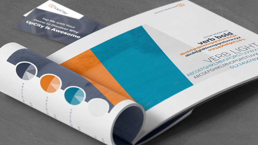
Our final result expanded and optimized the original UpCity palette to a 194% increase in color contrast compliance. Led by a richer, friendlier primary orange—matched with 2 variations of blue to differentiate body text & link text—the new palette was future-proofed! 8 additional primary and secondary colors included shades of green & red for proper error/success messaging.

Step 3: A Premium Brand Typeface
UpCity needed a modern and friendly typeface that was easy to read across any device & at any (reasonable) size.
We also needed a closely resembling fallback typeface for email marketing and other instances when technical limitations prevent embedding of custom fonts. Regardless of use case, I always choose typefaces with large x-heights, diverse weights, and special character support which are all crucial for design flexibility, smooth rendering, and ultimately, legibility (readability).

Type is art, but it’s technical, too. We don’t have any control over an end user’s personal device settings & preferences, so it was crucial to explore multiple typefaces across multiple devices. I assessed their fit to the brand personality we were looking to convey, how each complimented the new logotype, and how they looked in our new color treatments.

Font features like ligatures & old-style numerals enhance legibility and ensure proper number placement for the context of the design—key for UpCity since we knew data visualization was going to be a big part of our upcoming product enhancements.
Additionally, I never allow a browser to control the weight of text and always opt for a typeface with dedicated font files for each weight—same for italics. This maintains a smooth and professional presentation on-screen and not a choppy, pixelated appearance. I won’t even entertain a typeface that doesn’t include multiple weights!
Deciding to reserve the more whimsical Cooperative Sans for the UpCity logotype, we selected the Verb Regular family as our primary brand typeface and chose Source Sans as our fallback for use in assets like email templates, presentations (powered through the Google Suite), etc. Again, we didn’t want to use a common typeface for everything as we wanted UpCity to stand out in the market and have its own unique identity wherever possible.
Beyond beautiful (and functional) letterforms, we also needed a typeface that naturally fit into the strict UX & accessability guidelines we were drafting, which Verb did, rather beautifully!

Step 4: Bring it All Together
The new brand was finalized! Now it was time to create guidelines & about a million new assets…

I created in-depth branding guidelines for UpCity, covering details they never thought to consider before, such as color array rules for data visualizations, UX principles, color contrast rules, photography guidelines…everything needed to visually position this brand as an industry leader.
 UpCity Sales collateral
While I was finalizing these guidelines, I worked closely with my creative team to develop and maintain various marketing assets and templates (sell sheets, presentations, customer support materials, etc.). This way, we could get a real-world feel of how the guidelines worked in-practice and ensure everyone had input on the final results.
 UpCity slide templates
 UpCity email templates
Step 5: Website Refresh
Revamp UpCity’s marketing website with the new branding and better user-targeted content, answering the key question: “what’s in it for me?”.
Updating the design system for UpCity’s marketplace site could easily fill a separate case study all on its own! For this section, we’ll focus solely on the marketing & content of the upcity.com domain, powered by Wordpress CMS. In summary, we wanted to create a more informative, human-focused experience that better served both buyer and service provider audiences, while improving overall UpCity SEO.
and with me being the super-nerd I am, I wanted to switch to a more robust theme that was fully customizable, allowing greater flexibility & control for engineering, content, and design requirements.

Goal: make the value clear to humans.
Marketing pages for marketplaces (say that one out loud 10 times) are tricky in that you’re selling value propositions to two completely different audiences. Therefore, I created a more content-focused homepage to help the dual audience understand the “what’s in it for me” question, right away.

Goal: make the value clear to Google.
Internal linking was extremely important for UpCity SEO (and any SEO efforts, in general), especially links on a homepage. Links serve 2 purposes: guiding users deeper into the site & informing Google of which pages you consider to be the highest value. Over time, this “link juice” helps the pages you link to get crawled (discovered) by Google, boosting SERP ranking. So, not only adding more links but being strategic about the Marketplace pages (product areas) we wanted to focus on was imperative to success.

Goal: differentiation—subscription products can be a tough sell!
The new site contained one individual page for each subscription tier instead of the single comparison grid of features they currently had on one page.
This allowed us to better communicate the value and purpose of each subscription tier, utilize more subject-relevant & action-orientated headlines throughout all pages (remember, “scannability” is key), and set an H1 and title tag for each that told Google exactly what UpCity needed to say in the serp.

Goal: optimize & improve conversion rates.
These individual subscription tier-focused pages allowed us to embed feature detail comparisons, customer testimonials, and lead forms with more contextually relevant & action-orientated CTAs directly into each page. This allowed UpCity to continuously test and refine their marketing content in these areas to optimize conversions for the specific needs of each target market.
Jen had the vision, knowledge, and willingness to get her hands dirty and create something truly unique…I don’t know of another person who could have single-handedly accomplished all of this.
—Heidi Sullivan, UpCity’s SVP, Product & Marketing
The Results
 feedback from Garry Egan Jr., UpCity customer
2019 saw a huge growth in revenue (20%!) for UpCity and the immediate impact of the rebranding was extremely positive. Over time, it led to increases in brand recognition, customer trust, UpCity’s SEO traffic…and the sale of the company to Gartner (Digital Markets) in 2022.
My Takeaway
Rebrandings are fun but can be far more challenging and even involve more work than creating a new brand from scratch! However, having something established that you can leverage in comparisons throughout the creative process helps educate & influence stakeholders on what’s working vs. what’s not working.
Overall, I’d call this project (or series of projects!) a success, simply due to the breadth of work that was included, overall internal & external satisfaction with the new brand in-practice, and the opportunity to sell the true value of good design and expand UpCity’s creative team.
↓
If you’re looking for a new logo, branding, or web design, I gotchu.

Like what you see and want to make your brand shine? Awesome!